This page is under construction!
Modernizing an ERP system for web
Gastro Prof is a web-based ERP (Enterprise Resource Planning) system which is used by Matusz-Vad Zrt., wholesale trade service of frozen food, to collect, store and manage data from business operations. I led the redesign which improved the system's structure and resulted in a process speed increase of ~40%.
Goal
To streamline processes by creating simpler and more logical interfaces.
My main project at Matusz-Vad Zrt. was to redesign the Java-based ERP system to a web structure. The ERP is used across all departments, from warehouse to sales, integrating all business processes in one system. Since most employees were already familiar with the system's functionality—having used it daily for years—I wanted to maintain the core structure while enhancing the overall architecture to improve the user experience.
Problem statement
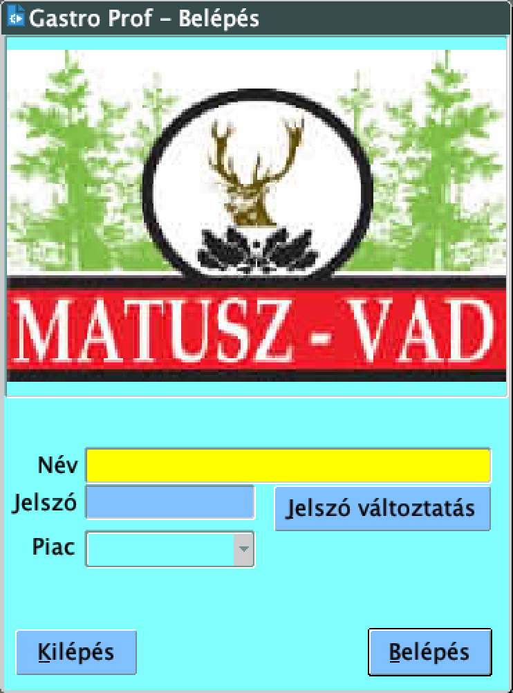
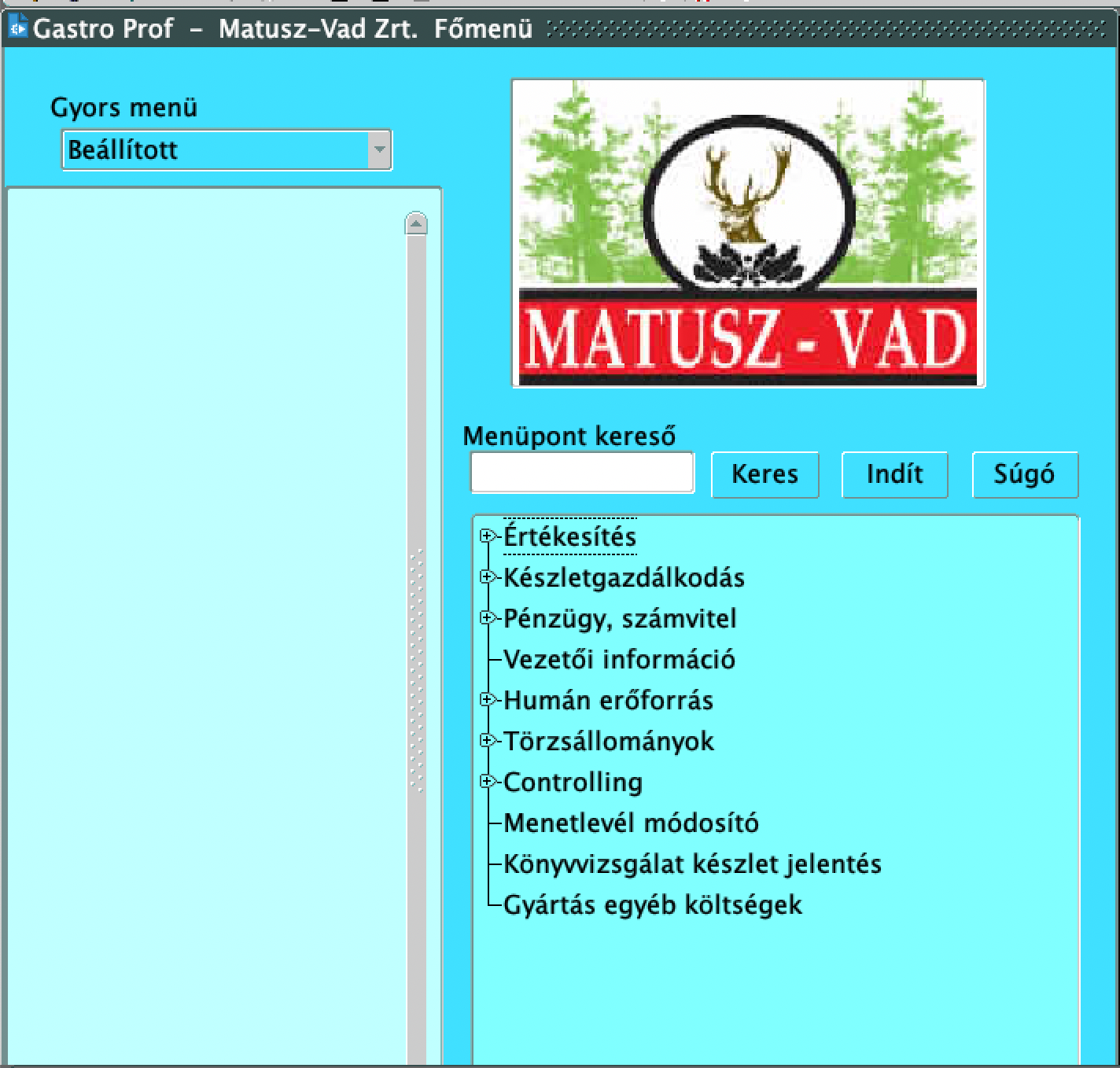
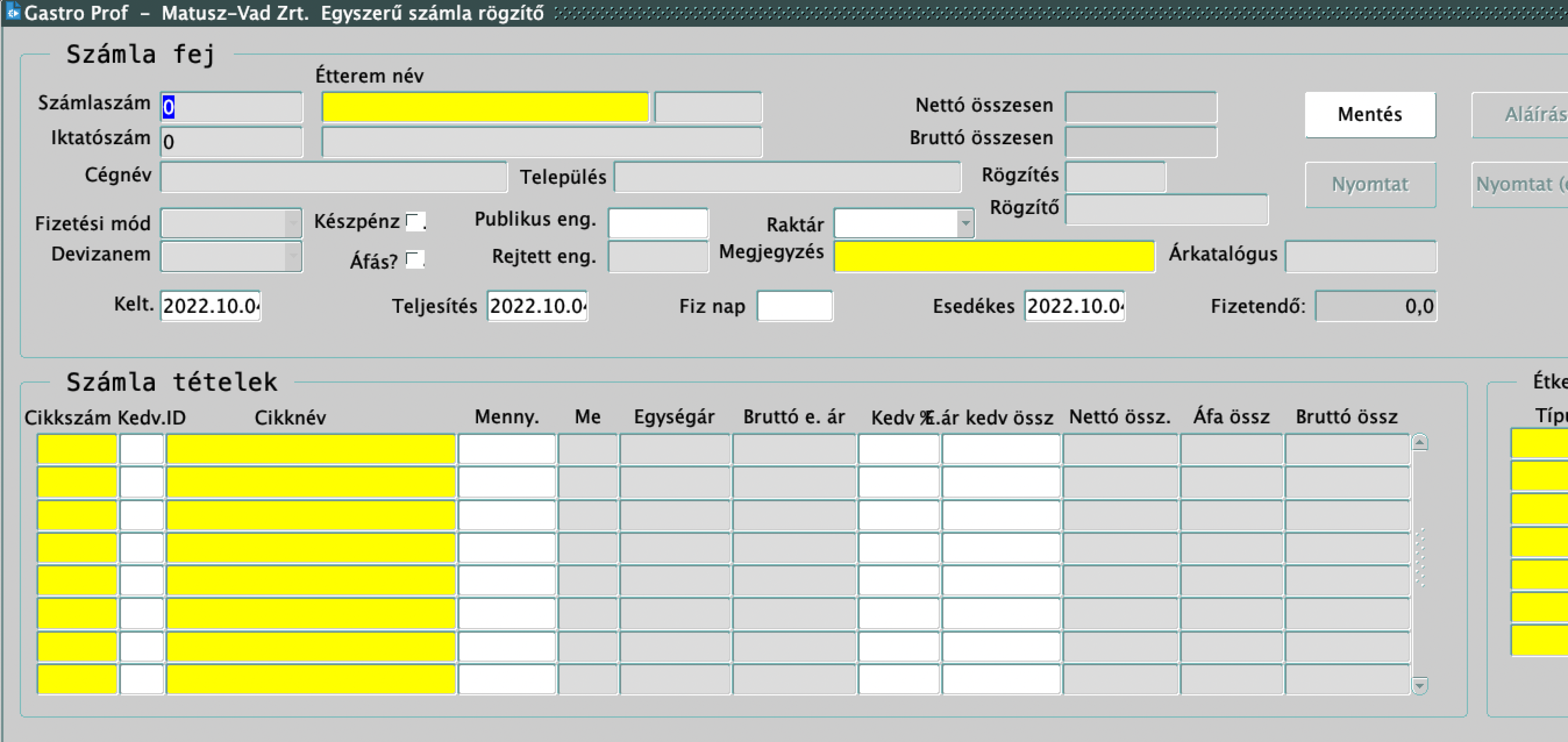
The Java-based ERP was functionally confusing, slow in performance and looked very outdated.
Research
I worked with SQL developers, employees, managers and a front-end web developer.
I visited various departments and spent hours with the employees. Most of this time was spent working the night shift at the warehouse in Győr, where I began by focusing on the night warehouse management processes. I watched the employees closely to understand their tasks and how real-life data was entered into the ERP system.
As I continued to ask the employees about the system, they expressed frustrations with the lack of multitasking capability, difficulties with searching and the unnecessary functions. Other issues I observed on-site included slow loading times, incorrect button and label titles, spelling mistakes, unclear error messages and inconsistent fonts and colors.
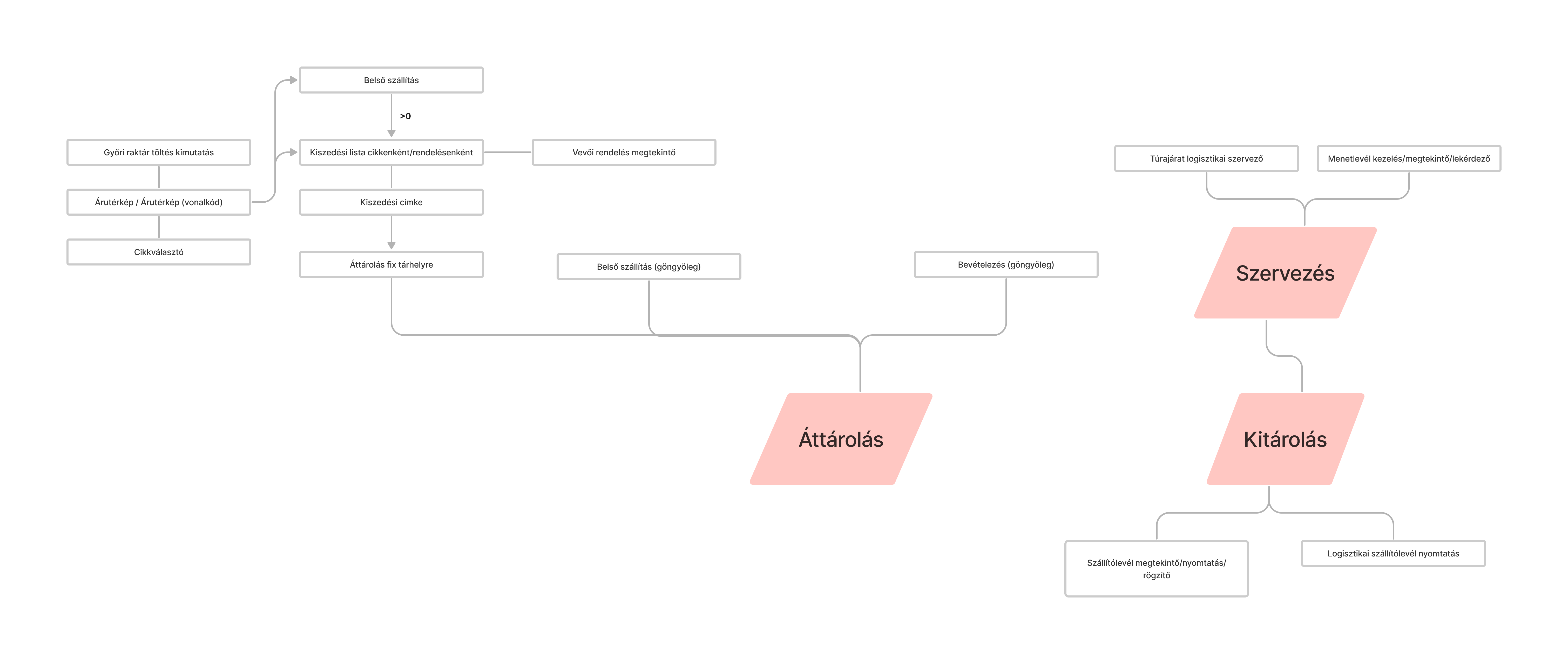
To better understand the departments and their needs, I mapped out the workflows, which helped me pinpoint the most intensive areas of work and match the relevant sub-modules to each step.
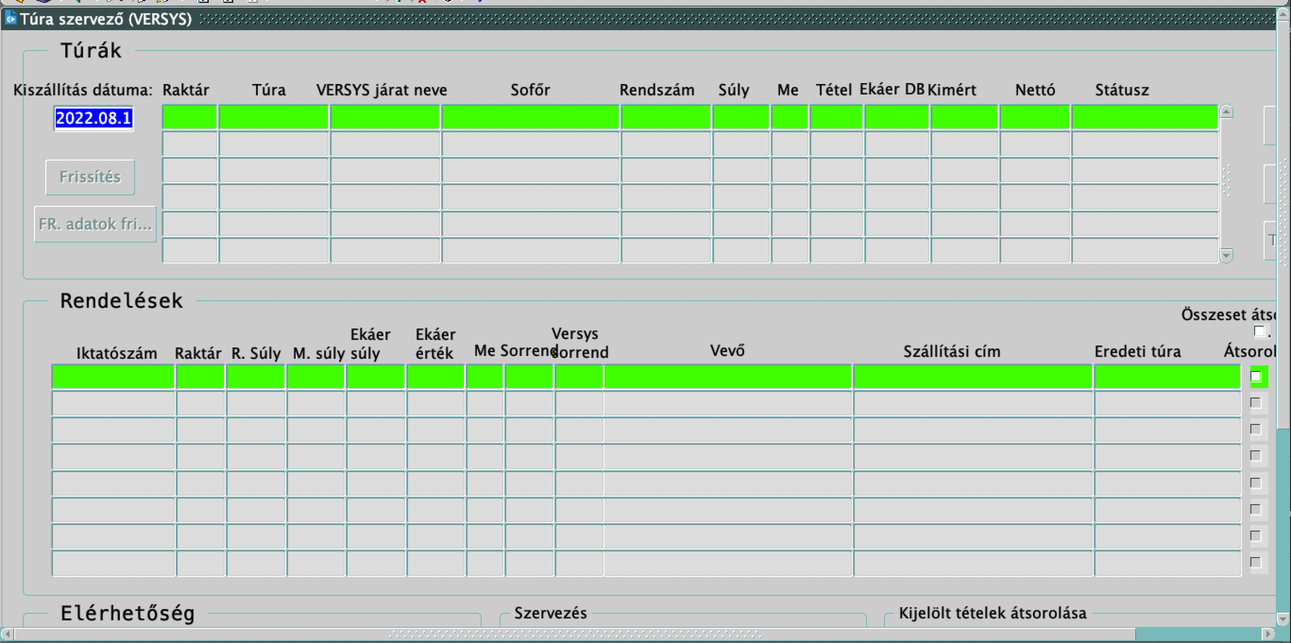
The use of too many windows at once was a critical issue.
Design system
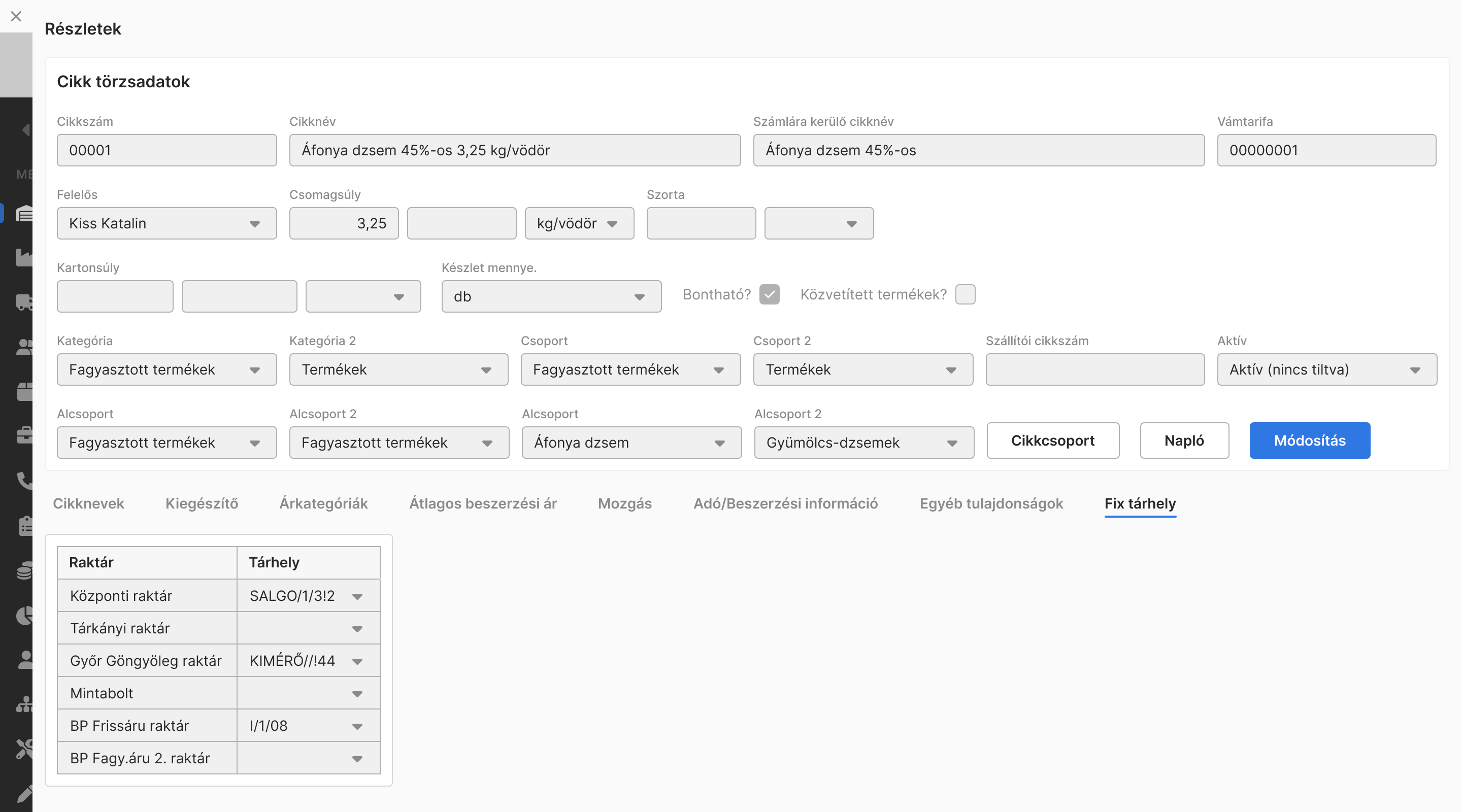
I created a design system with 100+ components.
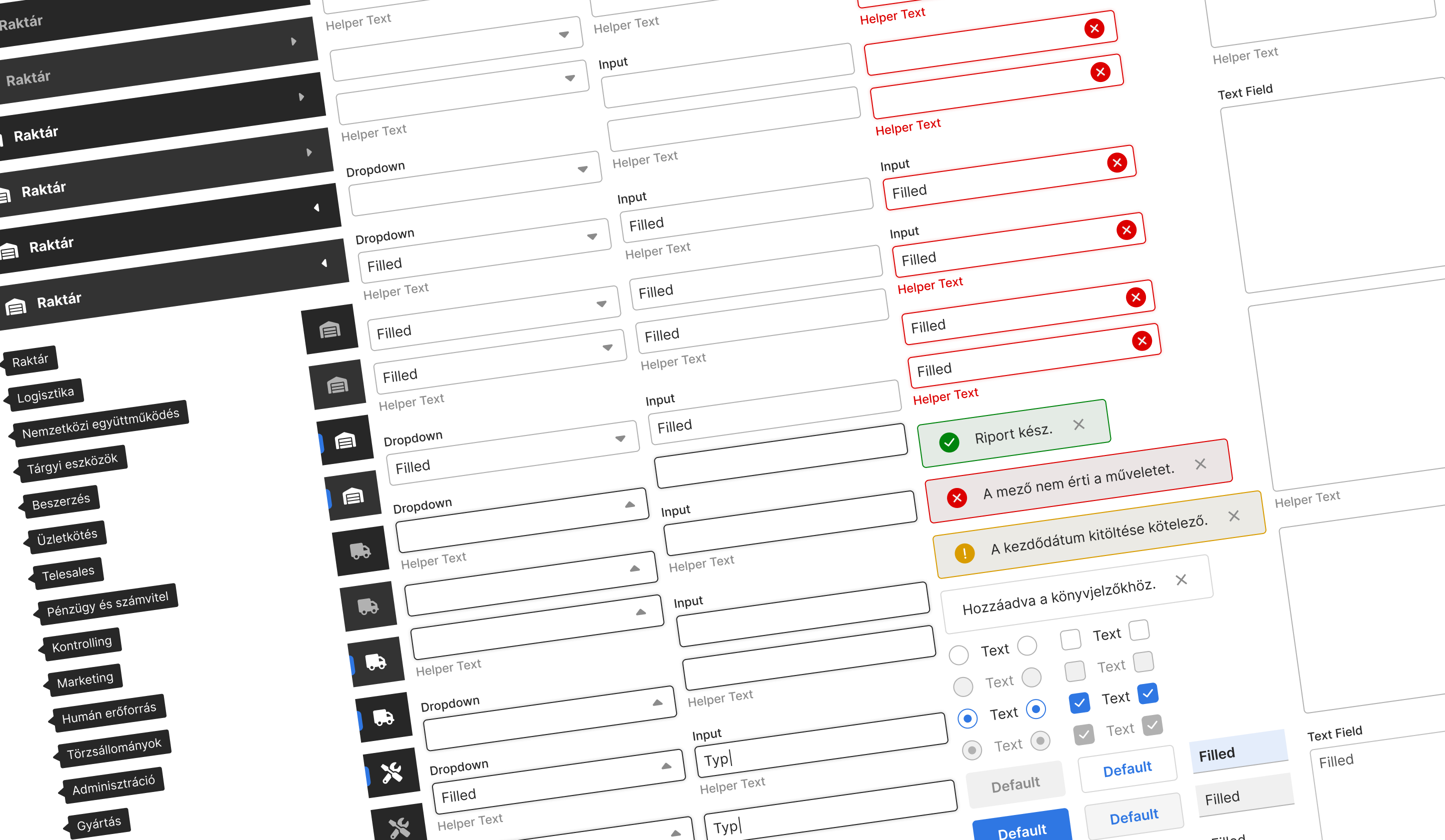
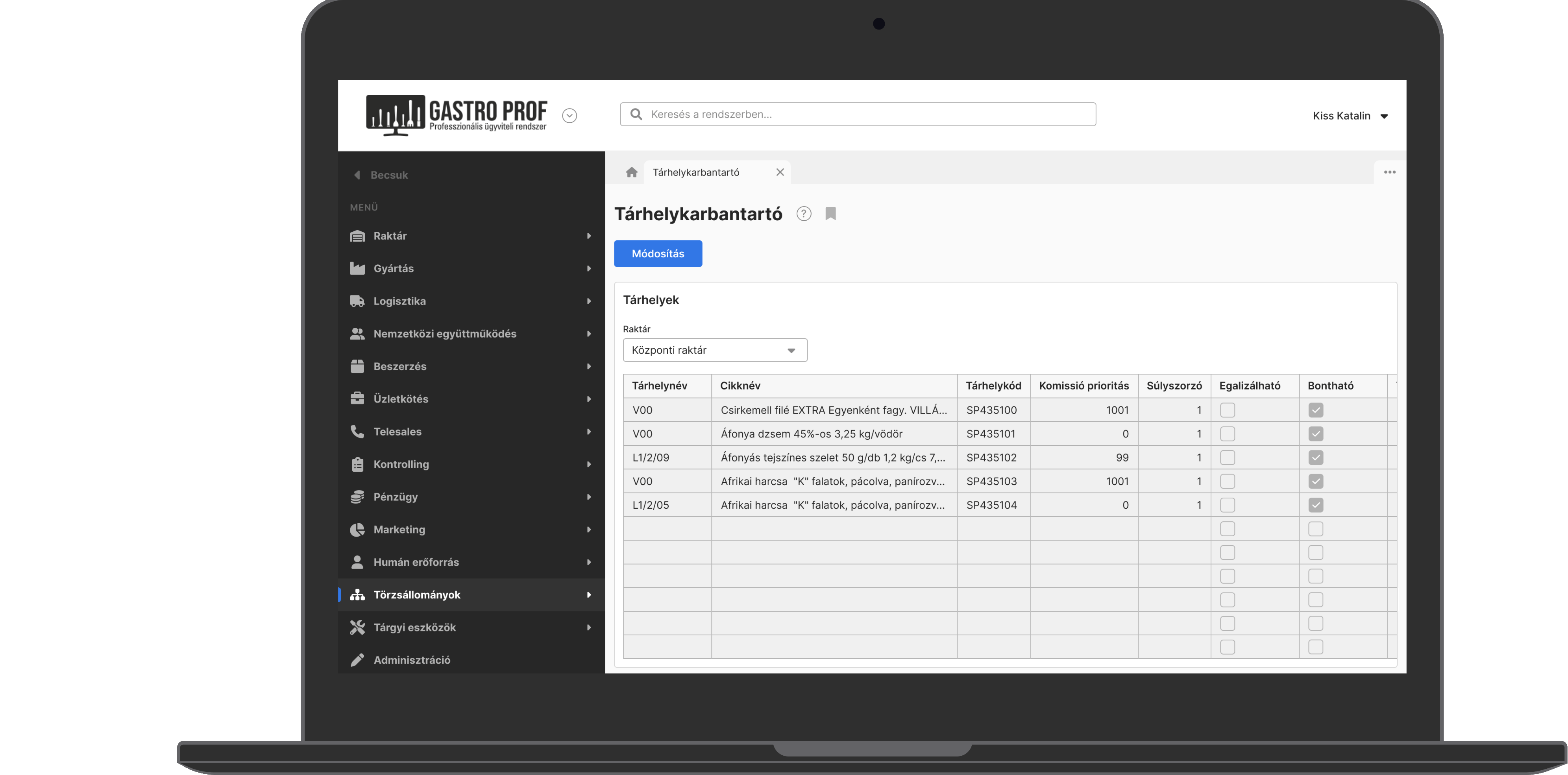
High-fidelity wireframes
Some of the 300+ wireframes are highlighted. I led usability testing sessions to ensure that everything met the criteria.
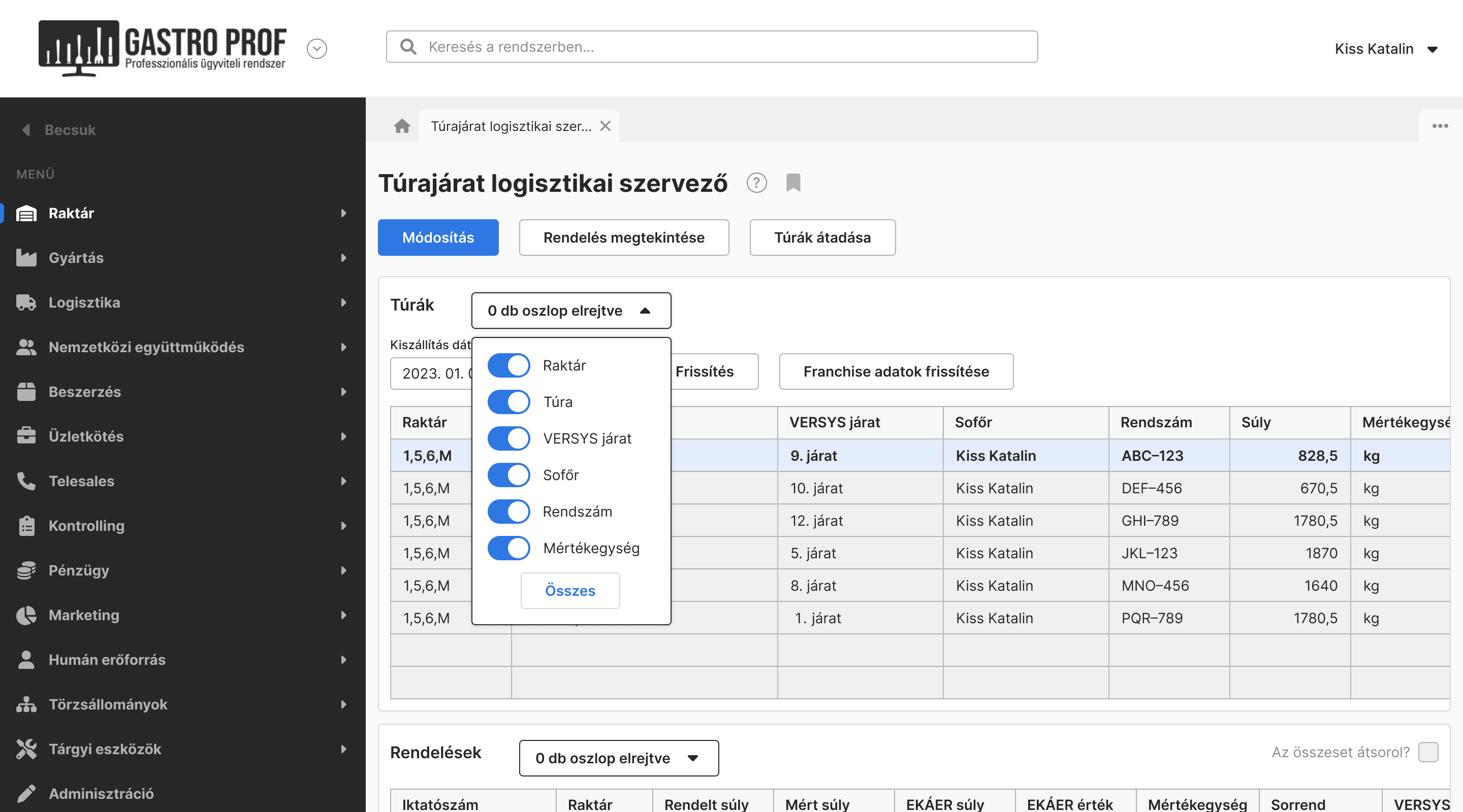
There are 13 main modules and I redesigned over 50 sub-modules (modules within modules).
I eliminated redundancy, merged identical processes to reduce the excessive number of sub-modules and created a more user-friendly interface.
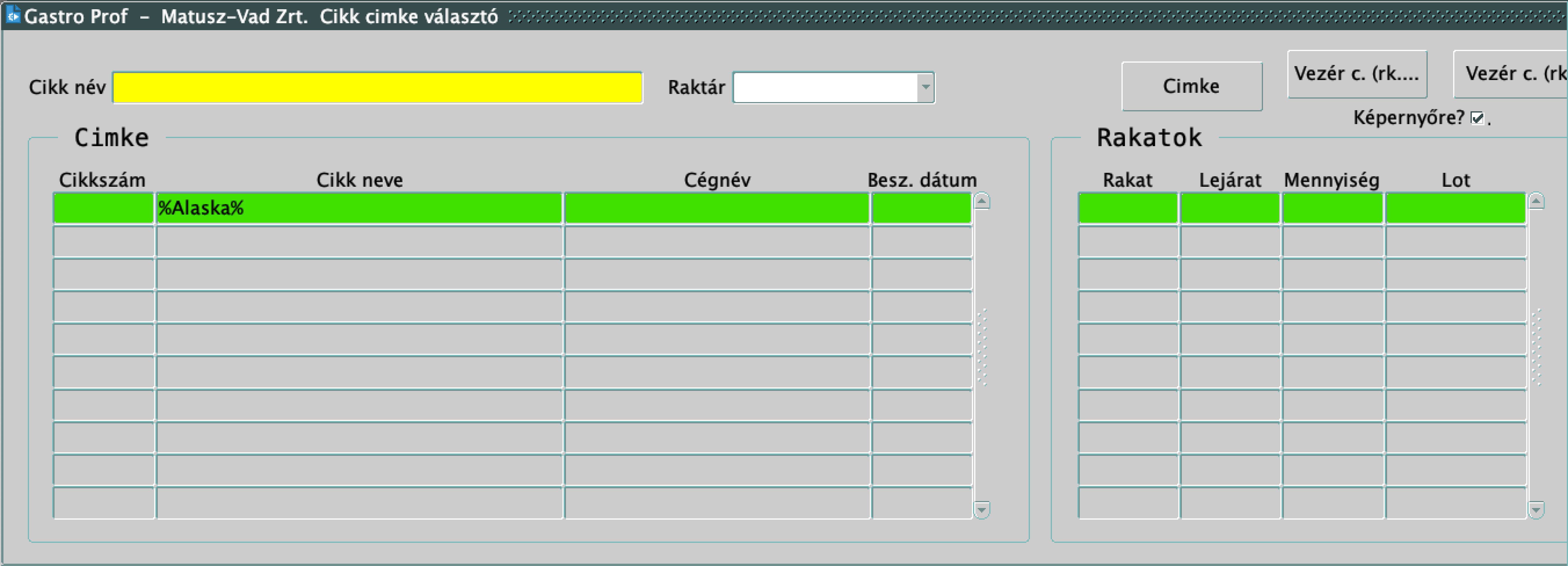
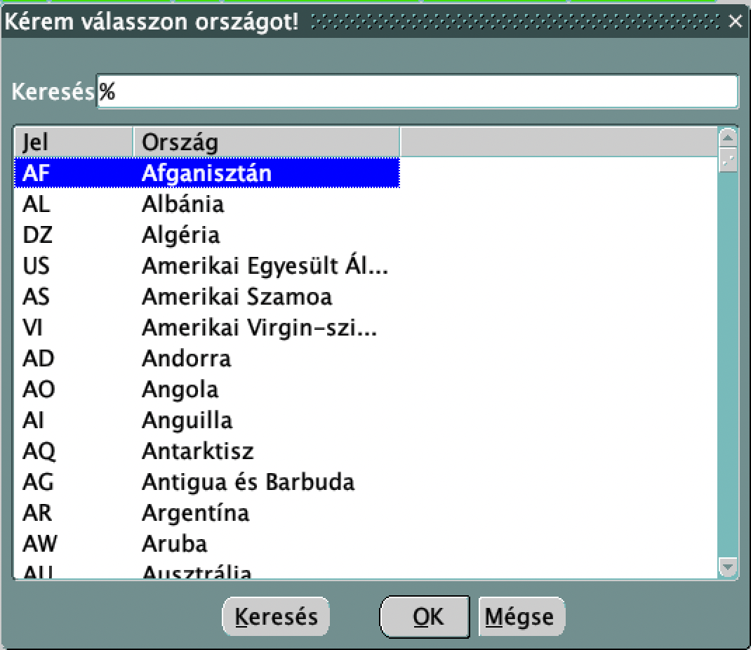
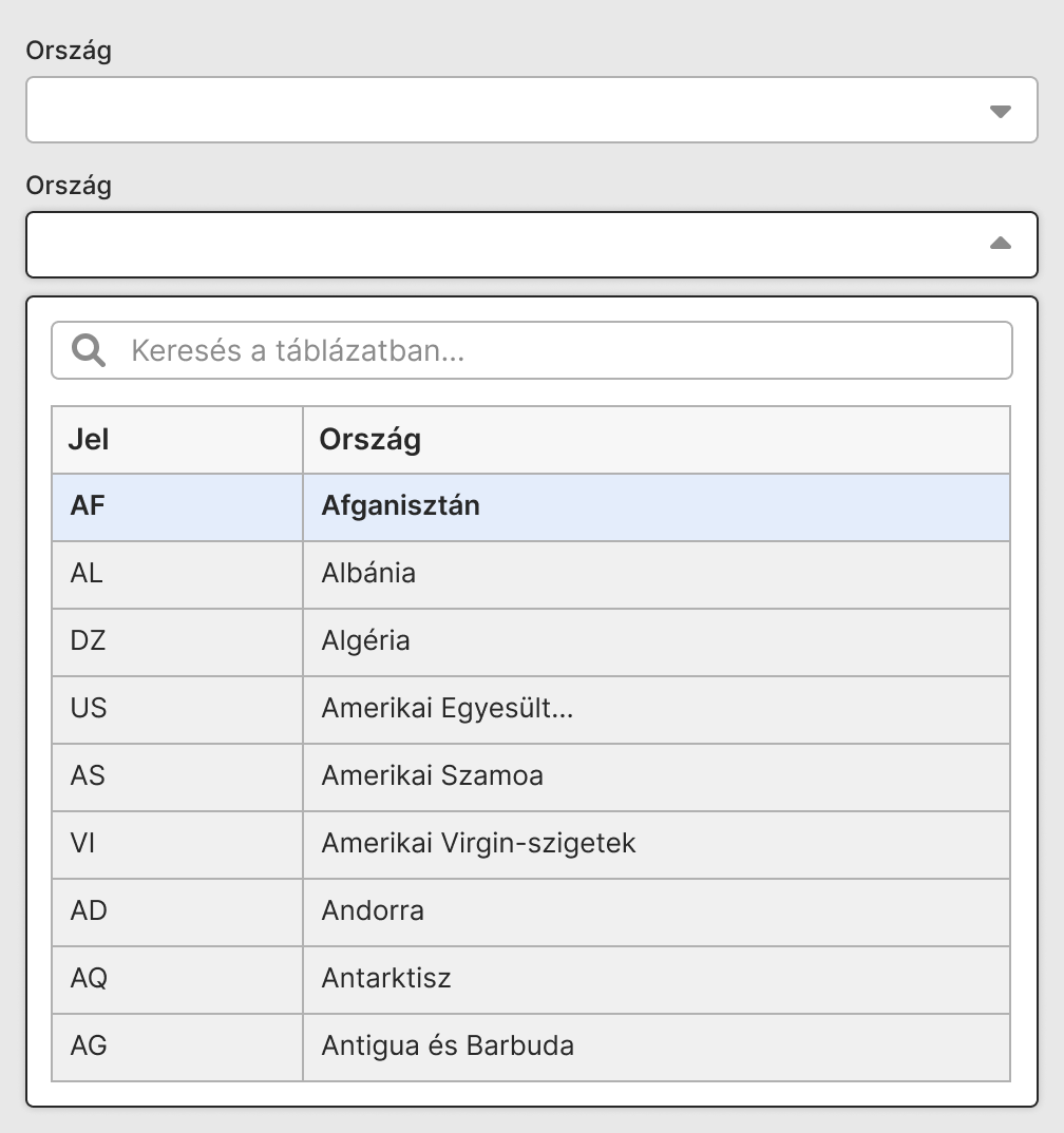
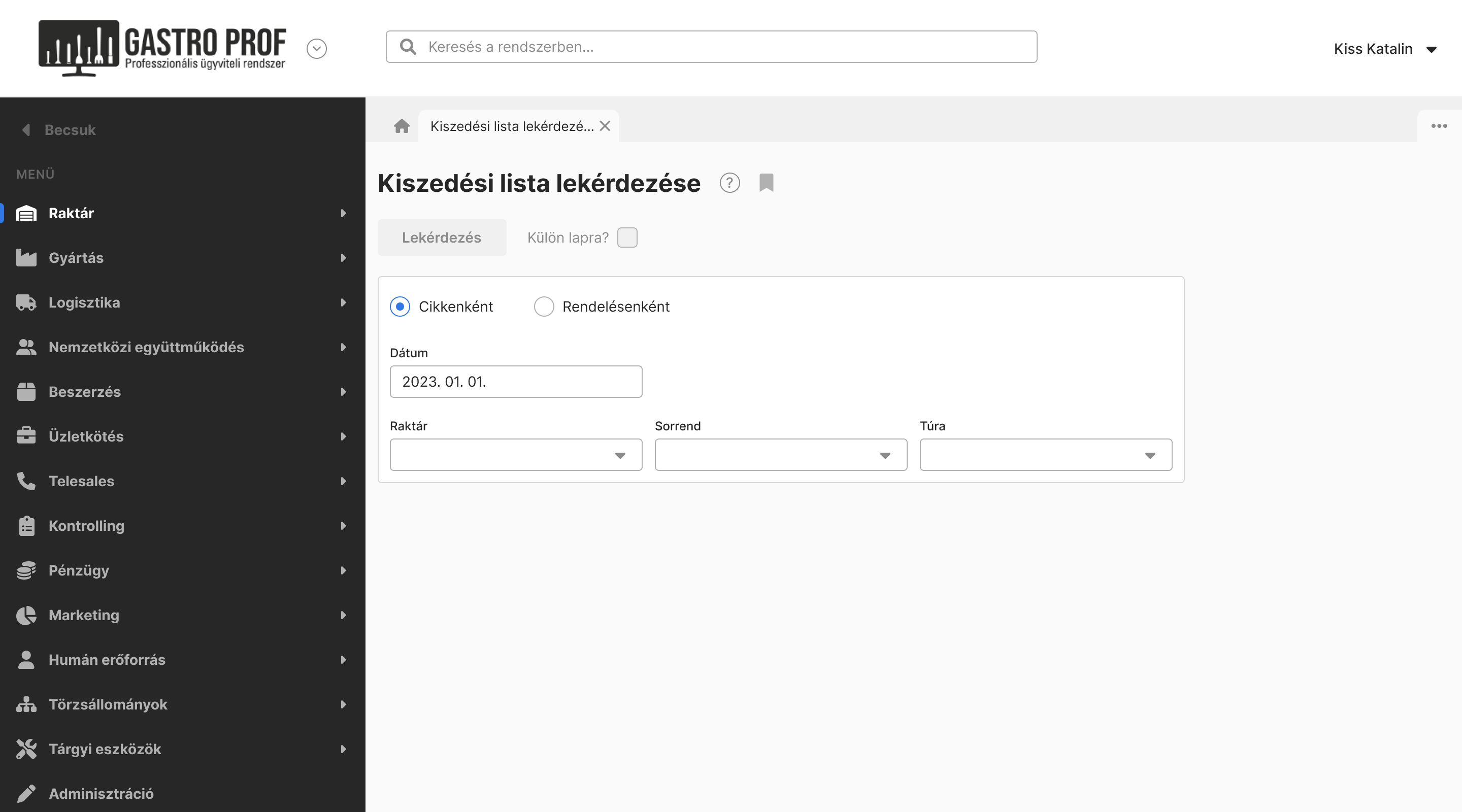
In the old ERP system, searching within tables was cumbersome. Users had to click on the cell, press F4, press Backspace and write the word between %% and press F8 to see the results. In my design, this process was simplified to a single step—users can now type the search term directly into the search field.
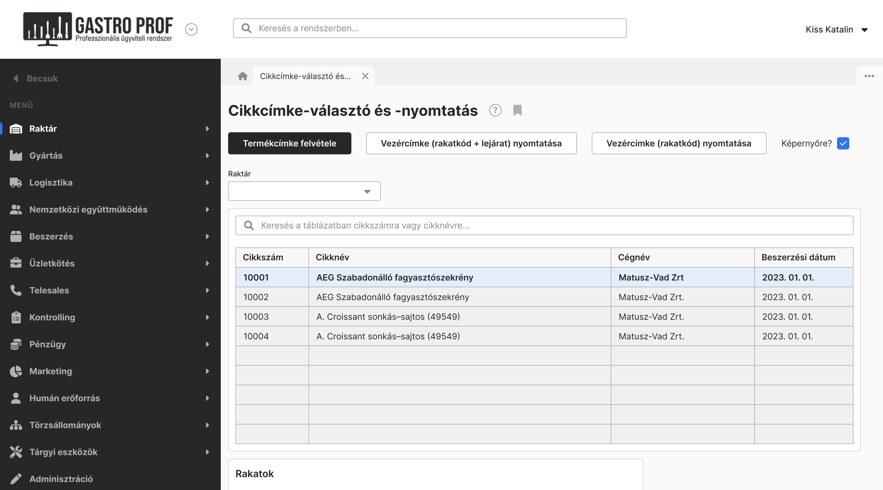
Tables with long rows are common in the system which creates challenges for data entry. In the old system, the column widths were narrow, requiring short column titles. In the redesigned system, the titles are now fully visible, but the length of the tables couldn't be fully reduced, so users must scroll horizontally to view the last column. To improve usability, clicking a row now opens a pop-up window displaying the field details.
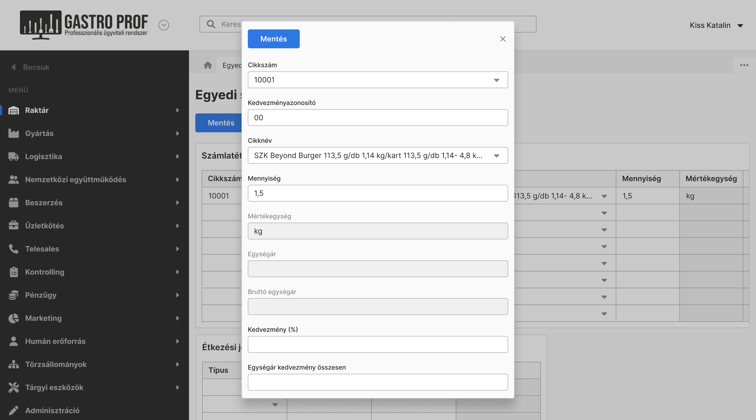
The yellow input fields were actually dropdowns with pop-up, accessible by pressing F9 on Windows, the combination of fn and F9 on Mac. I corrected these to align with design standards.
It was also necessary to hide columns in long tables, allowing users to filter out the relevant data. This feature is particularly important when the same sub-modules are used by different departments, each requiring different data for their specific tasks.
More wireframes:
We ensured that all the form fields were properly labeled for screen readers, every interactive element was accessible via keyboard by pressing Tab which moves focus in order. Modals could be closed using Esc, confirmation windows could be accepted by pressing Enter.
We also considered using key combinations because I observed later that some employees prefer to use the keyboard instead of a mouse of touchpad. I would have provided visible hints about the shortcuts in the UI, and would have ensured that they didn't conflict with any of the browser's shortcuts.
Impact overview
Matusz-Vad Zrt. is one of Hungary's leading food sales companies (with revenue of 1.5 billion Hungarian Forints in 2022) with nearly 2,000 types of products from 4 continents and 10,000 active partners in Hungary. With two offices and three warehouses, it requires fast, coordinated workflows across locations.
This is why an integrated ERP system improves efficiency in all areas. First and foremost, the system is now web-based, making it available from any computer, any place. This is particularly important for senior managers, salespeople and delivery drivers who are often out of the office.
Since the launch of the production modules, digitalization has streamlined and accelerated work processes. Previously, employees filled out production logs on paper, but now all data is stored directly in the ERP system.
In the past, employees had to open multiple windows simultaneously and wait 2-3 minutes to complete tasks which put a strain on the server. However, in the new ERP system, some tasks can now be completed in about 1 minute and 30 seconds, thanks to shorter user flows.
Working closely with the company's employees was highly effective for me. It was valuable to see how they use the system which helped me to design the new ERP system. I appreciated all the feedback they provided.
As the first and only designer at the company, I established a stronger UX presence within the company by introducing structured design processes and advocating for user-centered thinking.