Revamping the leading student jobs portal

Meló-Diák is Hungary's largest and oldest student jobs portal. To stay relevant for a new generation of students (Gen Z), both its brand identity and web application needed a refresh. It's currently in development.
Goal
To improve the brand and digital presence to better connect with people.
The goal was to design a web app that fulfills Gen Z's needs by making job search and administration simpler, faster and more intuitive.
Problem statement
The existing website was cluttered and difficult to navigate.
The index page was overloaded with static content, with only a small section for news updates.
The mobile app performed even worse, with a 1.3 rating on Google Play – signaling poor usability, low satisfaction and a digital experience that didn't reflect the company’s long-standing reliability.
Research
A UX researcher conducted interviews with students who held active memberships at Meló-Diák in 2024. I analyzed Google Analytics and gathered feedbacks from Google Play.
Some of the key insights from the interview sessions included:
– The tiled surface takes up too much space while providing little useful information.
– Categorization on the job listings page is often inaccurate, forcing students to read through all postings and making the process time-consuming.
– Job descriptions are text-heavy, lack proper highlighting and aren't structured clearly. Expectations should be easier to understand.
– In the CV settings, when selecting a native language, requiring users to specify reading and writing levels feels unnecessary.
Students shared their frustration with the mobile app:
"It's pretty basic, there are hardly any features. You can't filter your search, only set a city."
"I was finally able to register after a few days of trying..."
"It's an unmanageable surface. If I take on a position by chance, I can't resign."
"It would be useful if membership renewal could also be done in the Meló-Diák application, and not exclusively on the website."
Sitemap
I created a new sitemap to define which pages should be included in the redesigned website.
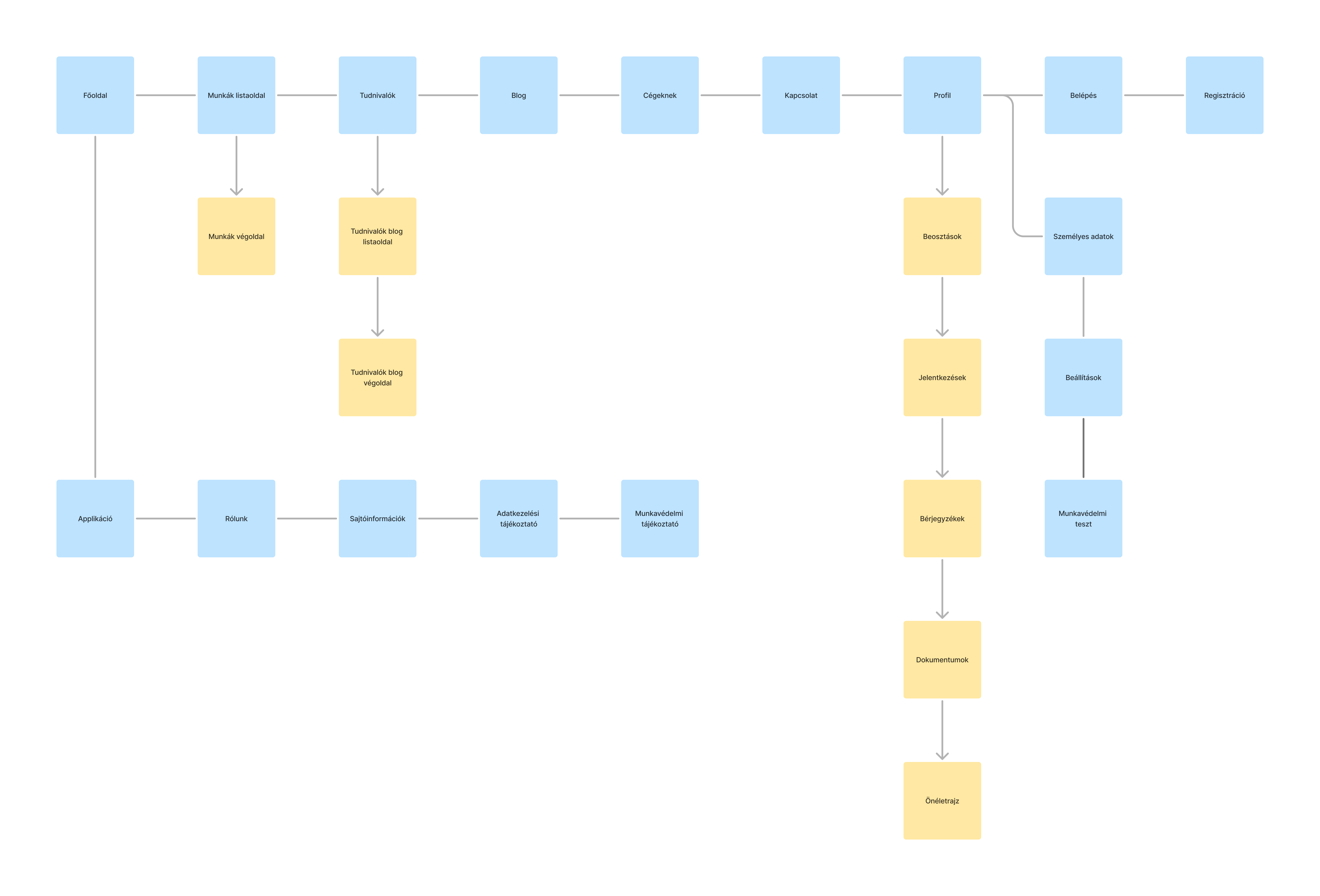
This clear structure laid the groundwork for designing a better navigation.
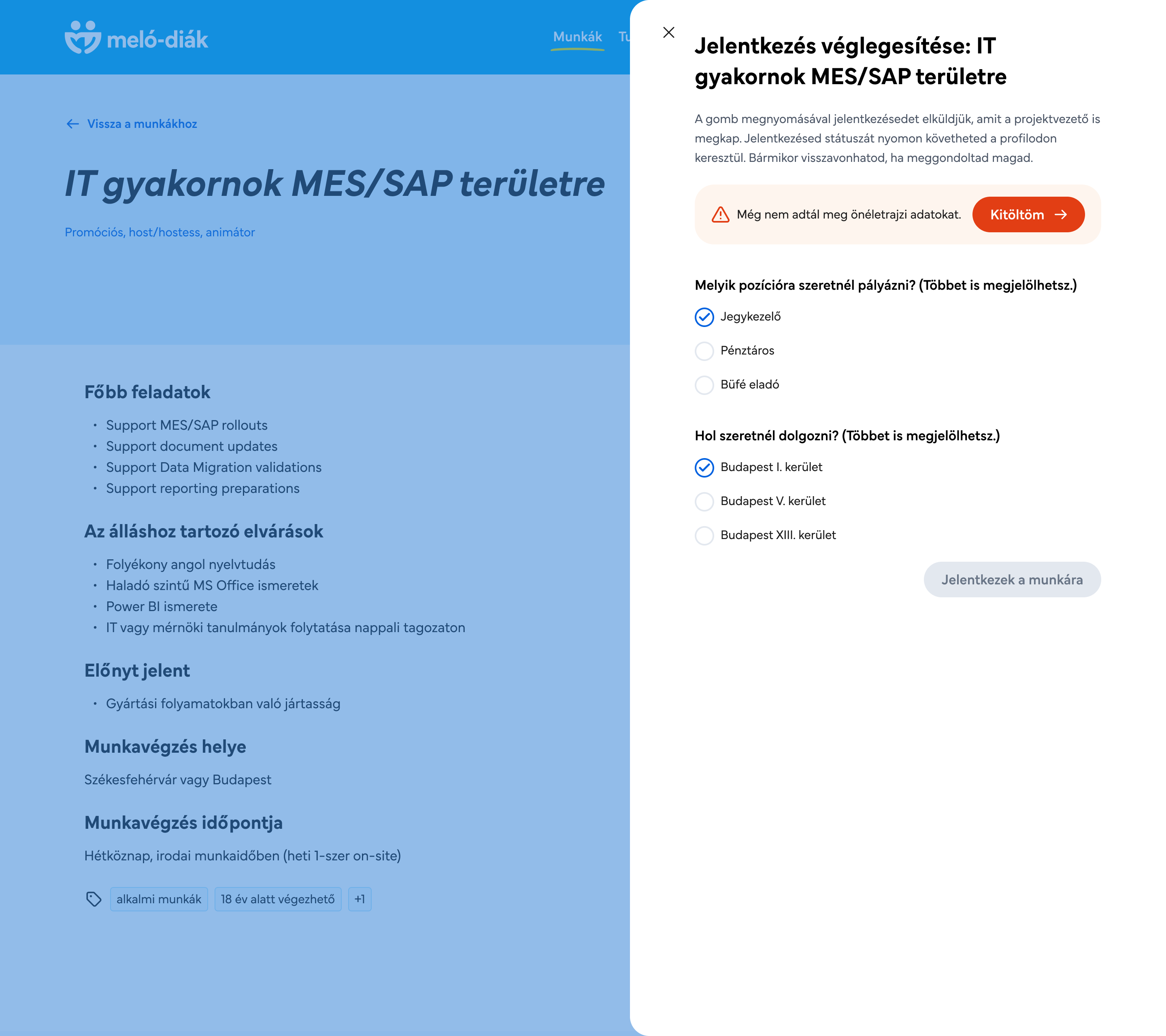
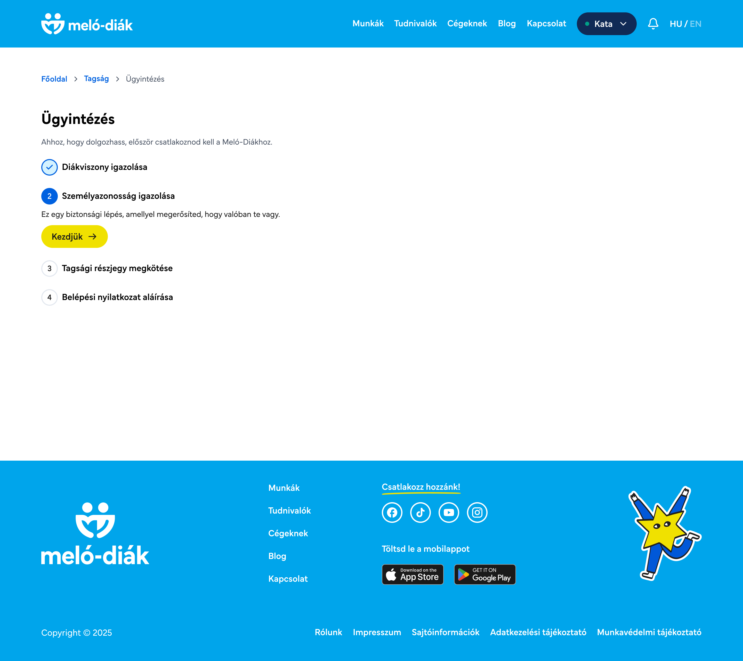
User flow
I drew a user flow to streamline the parental administration process in the application.
Previously, inviting a parent was problematic, even on the back-end side. Students under 18 can only complete membership registration with parental consent, but the process was unclear and often broke the flow.
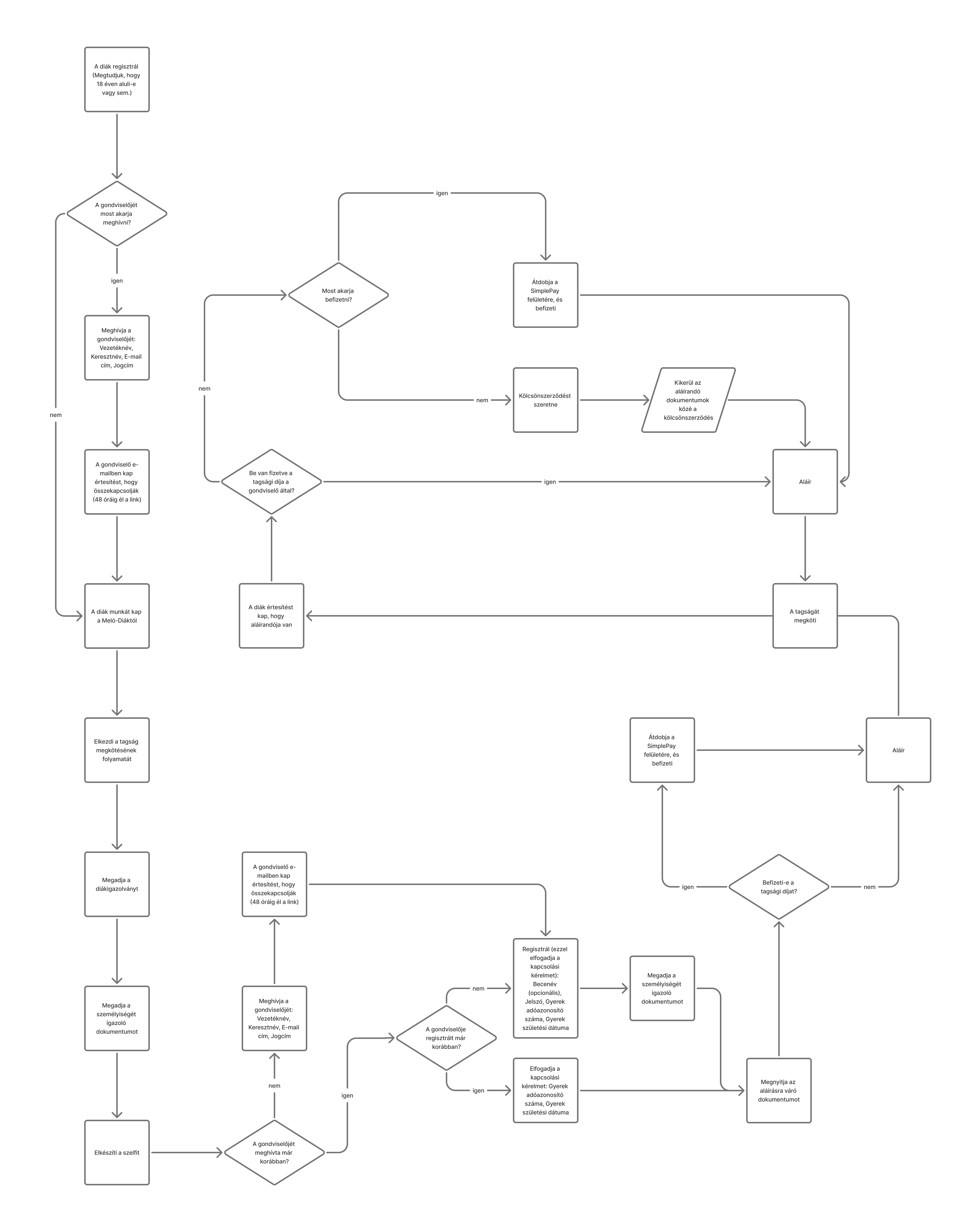
The new flow makes the invitation and approval steps more transparent and efficient, ensuring smoother onboarding for both students and parents.
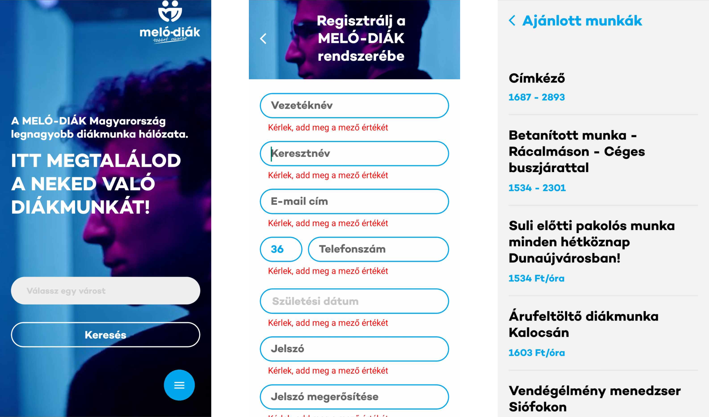
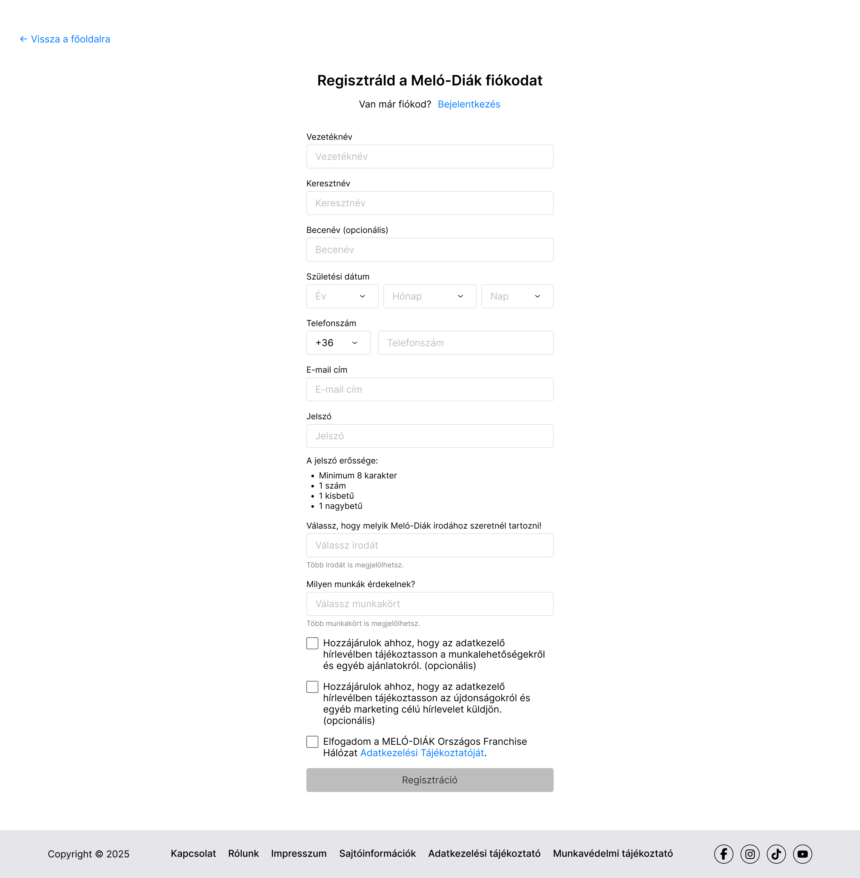
Low-fidelity wireframes
Based on the research results and sitemap, I created the low-fidelity wireframes.
We needed to make a
To stop parking and make a payment, users can click the button on the detailed page. They will have 15 minutes to leave the parking area, or the timer will reset. (At the entrance/exit, the scanner automatically reads the license plate number.)
Similar to the mobile version of the website, there are news, events, current offers, stores listed.
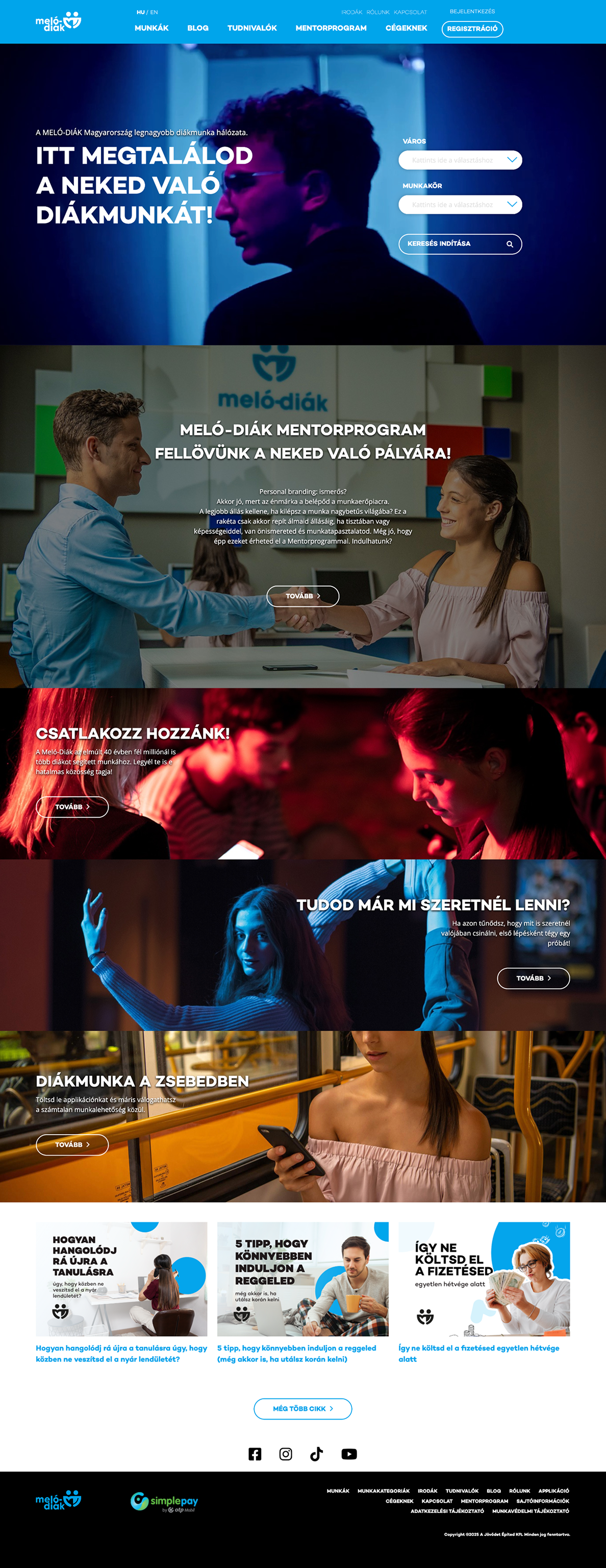
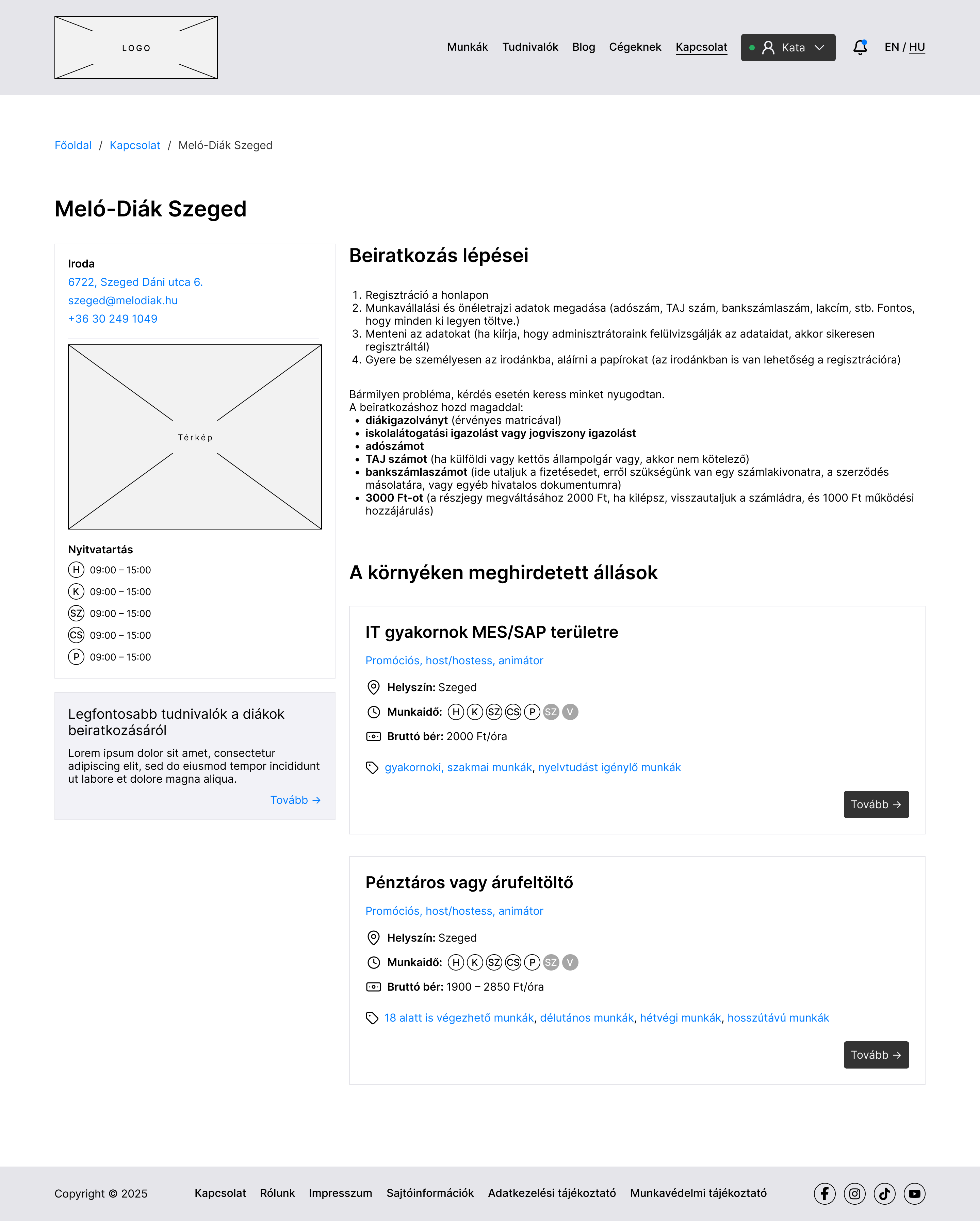
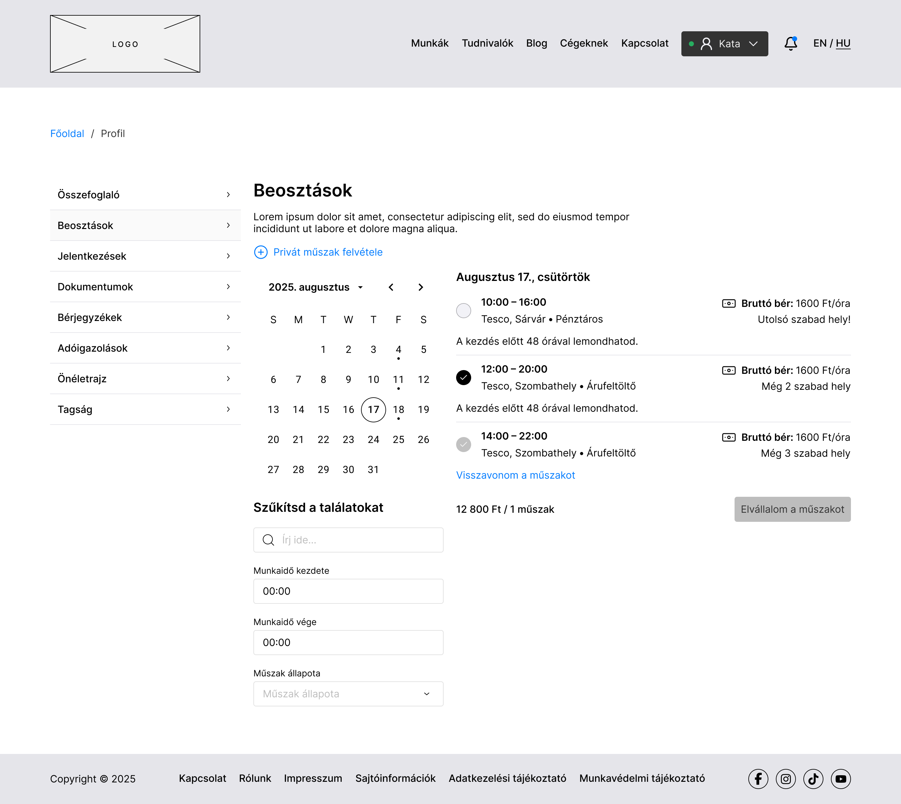
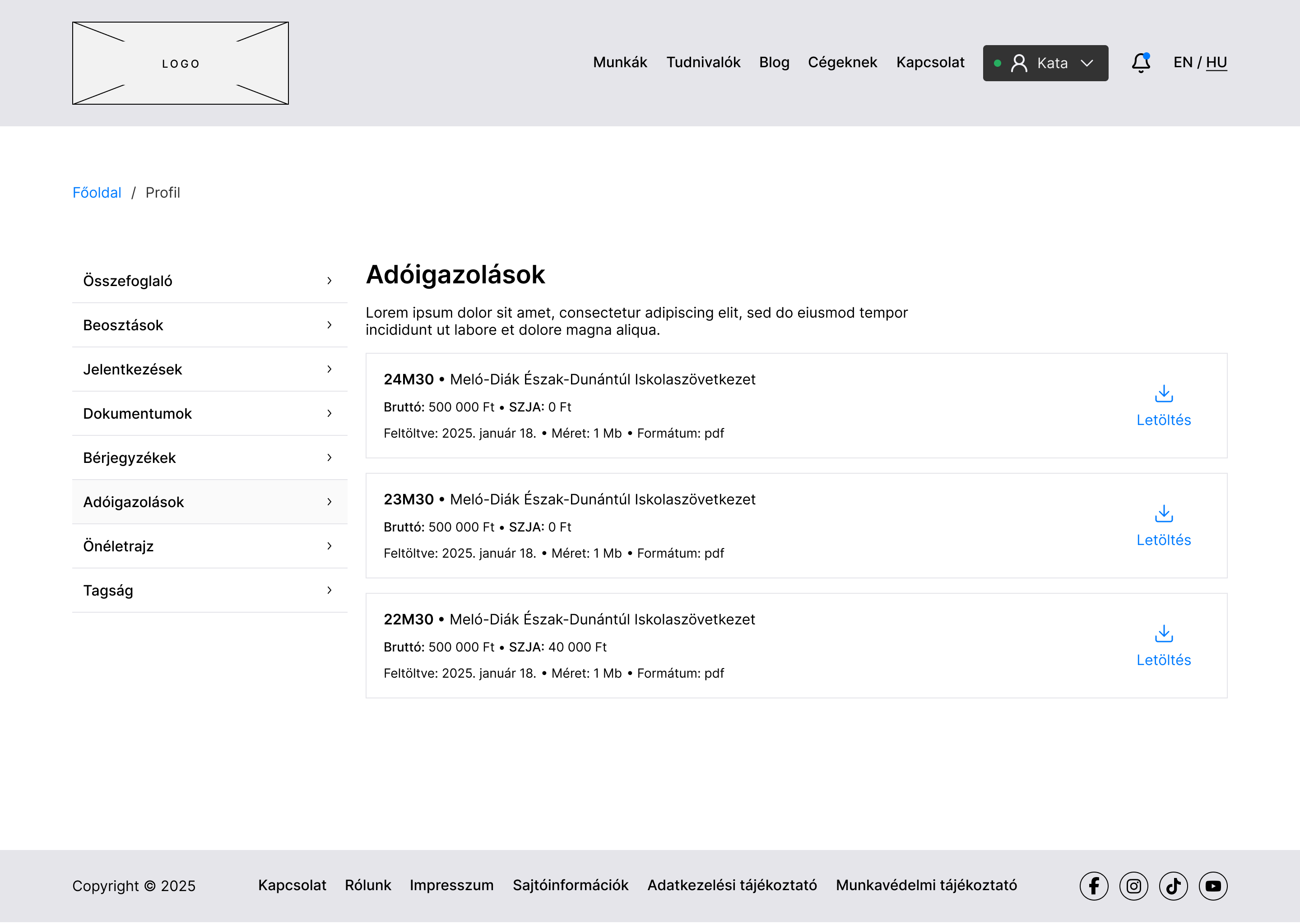
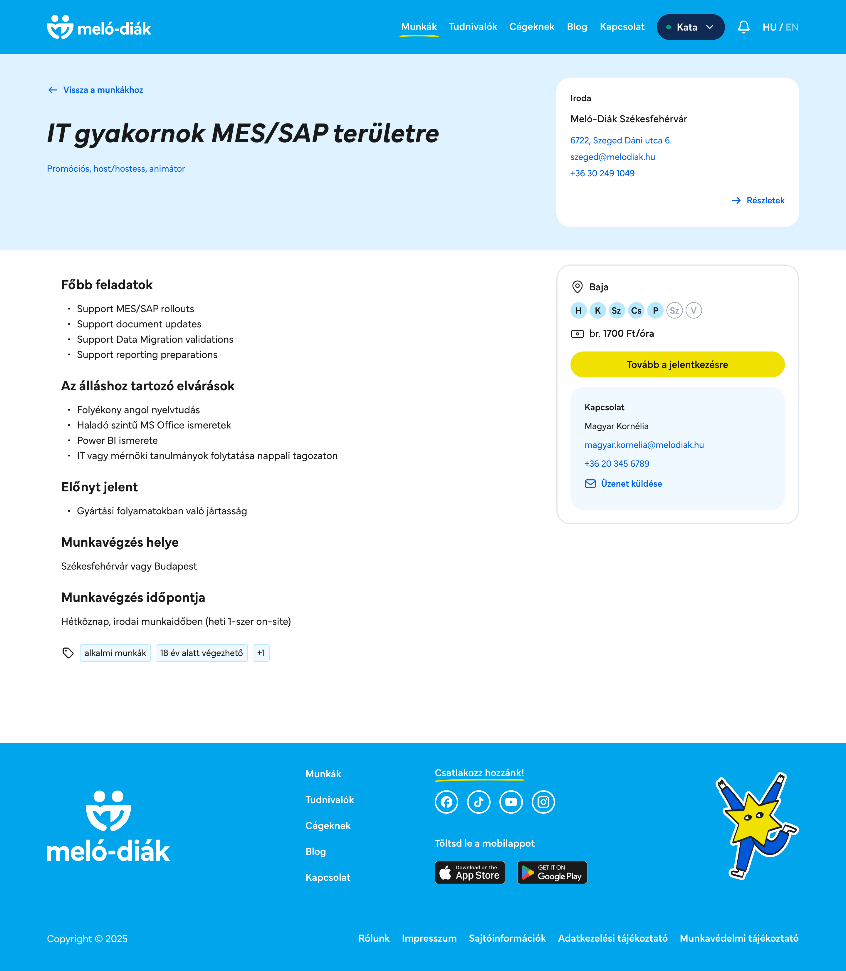
High-fidelity wireframes
Based on the research results and sitemap, I created the low-fidelity wireframes.
We needed to make a


To stop parking and make a payment, users can click the button on the detailed page. They will have 15 minutes to leave the parking area, or the timer will reset. (At the entrance/exit, the scanner automatically reads the license plate number.)
Similar to the mobile version of the website, there are news, events, current offers, stores listed.
Impact overview
The Lurdy Family Club brings Lurdy one step closer to becoming a popular destination.
The mobile application is an all-in-one, user-centric platform. Continuous development is essential to stay competitive and keep up with the changes at Lurdy. An ever-evolving product is also something users will find desirable.